RogerBW's Blog

Exciting Choices in Gaming Typography 18 April 2021

Someone sent me a link to a fan-made Traveller setting based on a USSR-derived interstellar power. And it's pretty interesting, except for the Cyrillic Thing.

The book is Kosmos 68 by Paul Elliott, and as I start to read it I get a sense that something is wrong. Every header is set in a special sans-serif typeface, I assume to make it "look Russian"; it may be that for some people that is the effect it has. To me, as someone actually able to read Cyrillic, it just looks wrong.

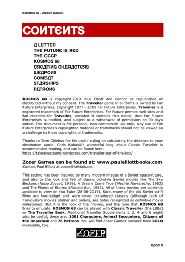
Д ("de") is used for for A, and Я ("ya") for R, and И ("i") for N, and Ш ("sha") for W, and Ч ("che") for Y… and it makes me itch. And that Є isn't a (modern) Russian character at all, it's Ukrainian; Э ("e") is Russian, and it's even pronounced "e" rather than "ye", though it's quite unusual and mostly used in foreign loanwords.

The font in question appears to be Kyrilla Sans Serif by Manfred Klein. Shame on you, sir.

It's an exoticisation and an othering: Those People have this weird script, we can't be bothered to learn it but we'll use it to look cool. We mostly know better now than to do it with other people's religions; can we stop doing it with their writing too? It is a constant niggle that irks me each time I try to read the thing.

But I was already somewhat sensitised to this because of the fifth edition of Chivalry and Sorcery. (What, Roger, are they still doing C&S? Why yes, yes they are, for values of "they" that don't include the original authors who are now dead; it's up at the Bundle of Holding until 26 April.)

Because I receive promotional copies of many Bundle offers I took a look. And there was a similar itch as I tried to read it, as if ants were crawling over the page. So I looked closely…

Yes, every "st" and "ct" has a ligature. Now I think this is Palatino Linotype, which is not at all a bad thing if you use it normally; this turning on of ligatures must be a conscious choice by whoever did the markup or layout. It's a constant drag at my reading attention while I'm trying to parse a complex meaning out of text that's perhaps not always phrased as clearly as it might be.

(In some places they also use Minion Pro, another free seriffed font that looks quite similar. And Microsoft's Georgia is embedded in the PDF too. And Times New Roman. Why do you need four basically similar fonts in the same document, as well as both Arial and Swiss721? You don't. It's a distraction.)

I'm not a font geek dammit. I'm not That Guy who goes to see a WWII or Great Depression film and shouts "but that's Helvetica!". But I do have a basic sense of design and layout, and it particularly irks me when someone has made a text less readable not through laziness – I have a profound respect for laziness – but through deliberate choices.

Tags: ranting rpgs

  1. Posted by John Dallman at 11:37am on 18 April 2021

    Well, that is rather rubbish. Presumably there are Soviet-styled Latin headline fonts available? I've seen a few on book covers down the years.

  2. Posted by RogerBW at 12:00pm on 18 April 2021

    Apparently the term is Faux Cyrillic. I've certainly seen it done with seriffed text too.

  3. Posted by Ashley R Pollard at 12:40pm on 18 April 2021

    In Russia Faux Crillic does you.

    Sorry, not sorry.

    I do agree that it doesn't aid in understanding, but not everyone has an interest in learning Cyrillic. Jeez, I struggled with it while researching and writing my World of Drei novelettes.

  4. Posted by RogerBW at 12:47pm on 18 April 2021

    Well, sure. But would it have hurt Kosmos 68 just to set it in normal type? And maybe drop in some artwork of Soviet propaganda posters for the proper feel? (Should be free to use as clip art, but I haven't checked.)

  5. Posted by Chris Bell at 10:54am on 19 April 2021

    I wonder how Chinese speakers felt about having their written language used in a way exactly contrary to the object of writing, which is to convey actual information rather than inchoate emotion? Random characters there for the Fu Manchu Feel, saying nothing at all to the English and gobbledegook to the Chinese, must have become wearing.

    Luckily the Chinese are an Ethnic Minority and now have their culture respected; the Russians are merely The Enemy and don't.

  6. Posted by RogerBW at 10:57am on 19 April 2021

    See also the urban legends about the person who gets a cool Chinese-character tattoo, only to learn later that it means something like "state registered prostitute second class" or "prime ham".

  7. Posted by John P at 10:02pm on 19 April 2021

    Minion Pro? There's a font for minions?

    Ben cares cama amee to scripto errec, donde nama ta bananas?

  8. Posted by RogerBW at 10:29pm on 19 April 2021

    I did see an advertising poster this afternoon offering "Minion-Proof Wifi". Several people I invite here have less technical skill than your typical Minion, so that's not something I'd really want…

  9. Posted by John P at 11:29pm on 21 April 2021

    I'm more concerned that my son has applied to do a cybersecurity degree, and wondering how I'm going to harden the home network sufficiently for when he comes back.

  10. Posted by RogerBW at 08:44am on 22 April 2021

    Employ him to do it.

Comments on this post are now closed. If you have particular grounds for adding a late comment, comment on a more recent post quoting the URL of this one.

Search
Archive
Tags 1920s 1930s 1940s 1950s 1960s 1970s 1980s 1990s 2000s 2010s 3d printing action advent of code aeronautics aikakirja anecdote animation anime army astronomy audio audio tech aviation base commerce battletech beer boardgaming book of the week bookmonth chain of command children chris chronicle church of no redeeming virtues cold war comedy computing contemporary cornish smuggler cosmic encounter coup covid-19 crime cthulhu eternal cycling dead of winter doctor who documentary drama driving drone ecchi economics en garde espionage essen 2015 essen 2016 essen 2017 essen 2018 essen 2019 essen 2022 essen 2023 existential risk falklands war fandom fanfic fantasy feminism film firefly first world war flash point flight simulation food garmin drive gazebo genesys geocaching geodata gin gkp gurps gurps 101 gus harpoon historical history horror hugo 2014 hugo 2015 hugo 2016 hugo 2017 hugo 2018 hugo 2019 hugo 2020 hugo 2022 hugo-nebula reread in brief avoid instrumented life javascript julian simpson julie enfield kickstarter kotlin learn to play leaving earth linux liquor lovecraftiana lua mecha men with beards mpd museum music mystery naval noir non-fiction one for the brow opera parody paul temple perl perl weekly challenge photography podcast politics postscript powers prediction privacy project woolsack pyracantha python quantum rail raku ranting raspberry pi reading reading boardgames social real life restaurant reviews romance rpg a day rpgs ruby rust scala science fiction scythe second world war security shipwreck simutrans smartphone south atlantic war squaddies stationery steampunk stuarts suburbia superheroes suspense television the resistance the weekly challenge thirsty meeples thriller tin soldier torg toys trailers travel type 26 type 31 type 45 vietnam war war wargaming weather wives and sweethearts writing about writing x-wing young adult
Special All book reviews, All film reviews
Produced by aikakirja v0.1