I tend to use the weather forecasts from the Met. Office as I find
them more accurate than the BBC ones (even when the BBC is using Met.
Office data). However, I find the
Severe Weather Warnings
rather less useful.
Some of this is presentation. There's a colour-coded scale of
yellow, orange ("amber"), and red for "Be aware", "Be prepared", "Take
action". ("Amber" and "yellow" should never be in the same scale!) But
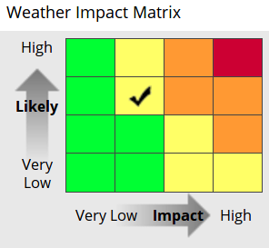
that scale is itself the result of a two-axis evaluation, of
"likelihood" vs "impact" (each on a four-point scale). A very unlikely
but highly impactful event makes for a yellow warning; so does an
absolutely certain but only somewhat impactful event.

(image from the Met. Office)
Now I'm one of the few fans of prediction spreads in weather
forecasting; I like the PROB30/PROB40 clauses used in aviation weather
forecasts ("there is a 30% chance of this happening") and wish their
use would be expanded. But I think that rolling them into a severity
measure like this, in the manner of a risk assessment, is something of
an abuse of the approach: if you have decided to act on a yellow
warning, what you might do in response to a very high probability of a
heavy rain is surely different from what you'd do if presented with a
tiny chance of Noah's Flood Mk II.
(And there are "warnings" and "alerts", which seem to be separate
things, but there's no definition of which is which.)
Then there's the question of what you should do. For anything short
of a red warning, this
comes down to
"pay attention to weather forecasts, and expect trouble, but don't
actually do anything unusual yourself". Actually it's worse than that,
because the table claims to be based on the impact level (Very Low,
Low, Medium, High) but it's indexed by alert colour – and the alert
colour only tells you the composite measure of likelihood and impact
level. So which is it, guys?
What you should actually do, in the unlikely event of a red warning
(or a high impact level?), is listed on a separate set of pages, and
there finally we have some reasonable advice. It may seem basic and
obvious, but it's clearly not obvious to everyone. (If you're waiting
to lay in stocks of emergency food until the emergency has been
declared, you're naffed, of course, because everyone else will be
trying to buy them too.)
But I have been receiving Met. Office warnings for all of south-east
England (the best granularity they offer) for several years, and I
have never once seen a red warning. On the other hand there are yellow
warnings nearly every week (total of 772 warnings/alerts in 4.5 years,
though often there are several successive warnings/alerts about a
single event)… of which the vast majority, naturally, come to nothing.
There have been 27 amber warnings/alerts in that time, but I think
only one or two of them had a direct impact on me. I can see why they
warn about everything they think might be dangerous; they're scared of
the
Michael Fish in 1987
effect, and these days probably of being sued too. On the other hand
there certainly has been severe weather (several occasions of wind)
that did affect me, and which wasn't warned about. All of this
means I'm less and less likely to take the things seriously.
So how would I do it differently, without magically becoming more
accurate in the forecasting? First, split likelihood and impact, and
keep them split. Second, remove the yellow warnings completely: issue
warnings only when there's a substantial chance of significant
effects. Third, allow more granularity in the warnings: I don't need
to hear about storms hitting Brighton if they aren't going to reach me
in Bucks. (On the other hand I'd like to be able to check for alerts
along a rough line between home and wherever I'm planning to go that
day.)
Comments on this post are now closed. If you have particular grounds for adding a late comment, comment on a more recent post quoting the URL of this one.