There are various good reasons to develop a symbology for colours, and
there are several already. Why am I proposing another?
Well, the immediate reason was the release of
ColorSym, which looks like a decent approach,
but is basically an AI-washed copy of Peter Vel's ideas from
2021
giving him no credit. (I recommend reading that post, which explains
much of the reasoning for wanting to do this.) Vel also mentions
ColorAdd, as seen in e.g. Sea Salt & Paper, but doesn't mention that
it's also under mysterious and non-public licencing conditions. For
clarity, I place what follows in the public domain, though I'd like to
get credit (along with Peter) if you use it.
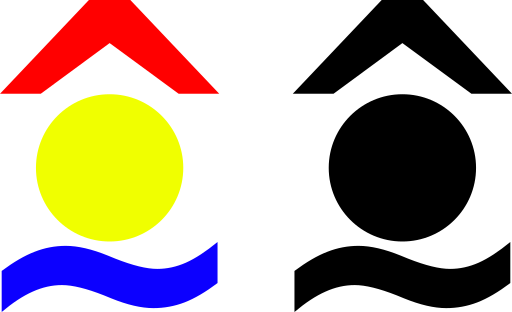
Vel's proposal is broadly this:

The chevron is red for fire, circle yellow for sun, line blue for
water; these symbols for composite colours represent orange, green, purple
and… brown? Let's not worry about that for now.
So I'll start with that (he has convinced me that the RYB colour model
is right for this), but return the blue line to the original wavy one,
because I want to use straight lines for something else. The presence
or absence of these symbols can indicate red, yellow and blue
pigment components as before; all three of them indicates black. (I
think I have more games with black components than with brown, and if
not, too bad. We'll support it later.)
Also I'll use an actual yellow shade for my examples rather than
Vel's orange.
Now how can this be extended? I'll call this "Vel Plus".
Putting the symbol in an enclosure (e.g. a square) is semantically
null, but allows us to indicate the absence of any dye component,
i.e. white.
A darker shade is shown with a "+" symbol (crossing the space occupied
by the circle, shown inverted if the circle is present) and a lighter
shade with "-". (Perhaps the sense is not obvious, but "more ink" and
"less ink" is the mental model, just as "no ink at all" is white.)
Grey can thus be indicated as a light black (all component symbols
with a "-"), or a dark white (enclosing box with a "+"); the latter is
simpler. Or if it matters (hello Automobiles) we could say that
light black is a dark grey, and dark white is a light grey. (And brown
is back, as a dark orange or yellow.)
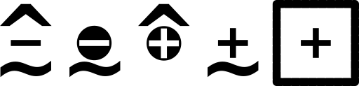
In order: red and blue, lighter, is magenta; yellow and blue, lighter,
is light green; red and yellow, darker, is brown; blue, darker, is
dark blue; white, darker, is light grey.
I think that should be enough. The RYB colour model isn't well suited
to subtle shade representations (there's apparently an edge case where
having one component at full intensity, and two others at 50%, can
indicate either of two shades), and a game with more than 22 different
colours needs more help than I can give it.
The only thing ColorAdd supports that this doesn't is shiny colours.
CA supports gold and silver; we can do better than that, by
surrounding any glyph with short radial rays.
And all of this is readily sketchable, without lots of fiddly detail,
which should make it possible to adapt it to specific graphical styles.